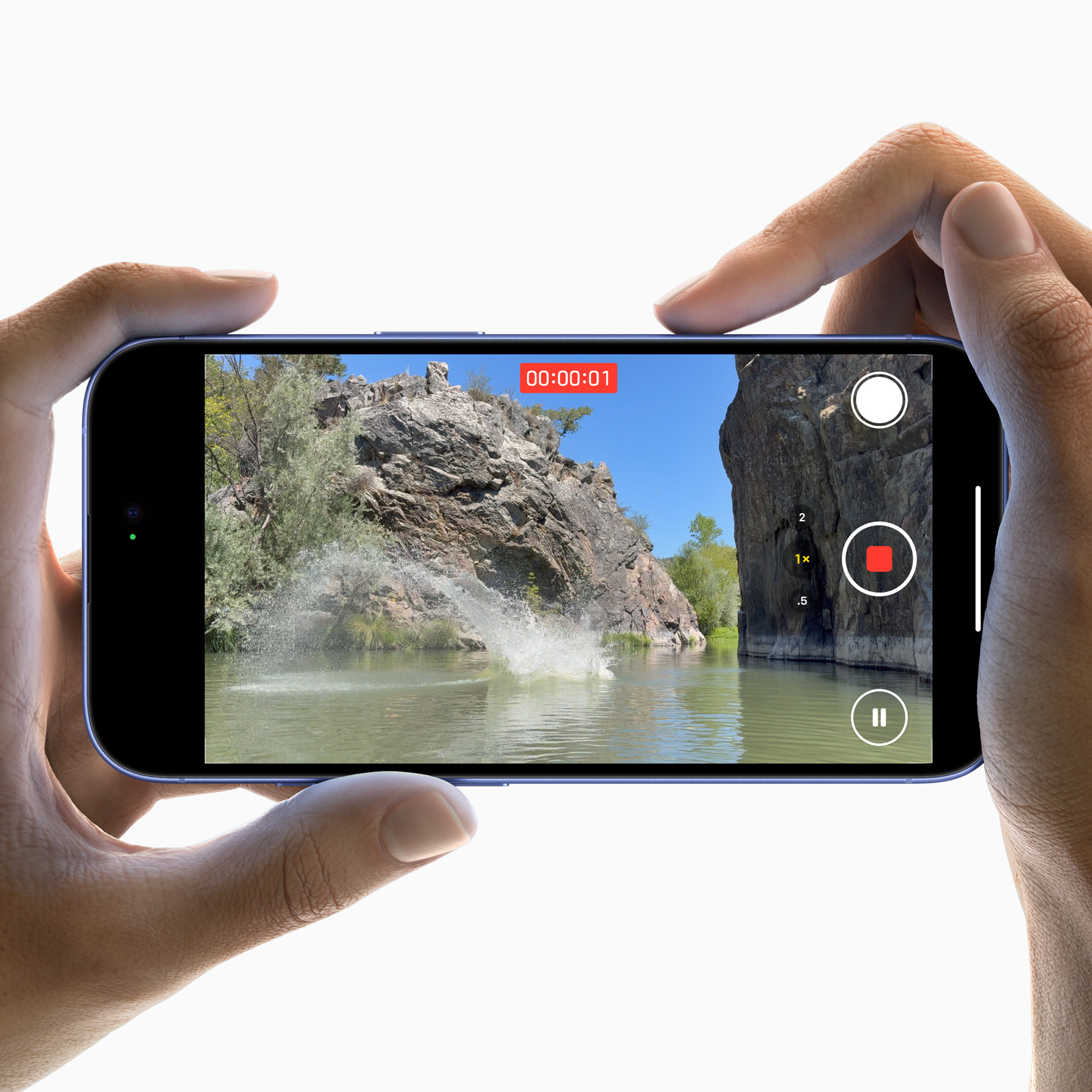
The iPhone 16 Series ( iPhone 16, 16 Pro, 16 Pro Max, 16 Plus ) with a ‘Camera Control’ Button has sparked many user reactions from a wide range of users online. This new feature, designed as a customizable button primarily aimed at camera control, has received mixed reviews, with some users finding it transformative and others calling it impractical. Here’s a breakdown of how iPhone 16 Series users are engaging—or not engaging—with this new feature.
The information below is formulated based on real-world users commenting on a Threads Post asking, “Hey, People who bought Apple iPhone 16 Series, are you using the Camera Control regularly? Or just abandoned it after a couple of tries?”.
The Pros: Quick Camera Access and Added Convenience
For those who view it positively, the Camera Control Button’s appeal lies in its speed and ease of access. Many users appreciate how quickly they can launch the camera, often finding it faster than screen-based shortcuts. This feature is particularly popular among those who enjoy capturing spontaneous moments, as they no longer have to navigate through the camera app to start snapping photos.
Beyond quick access, some users have embraced the Camera Control Button for more nuanced camera functions, such as switching between lenses and controlling zoom. Others have even paired it with the latest iOS 18.2 beta, using the button to activate advanced features like visual intelligence. For those willing to adjust their habits, the button becomes an essential part of their photography experience, replacing older shortcuts and making camera access easier.
The Cons: Accidental Presses and Unintuitive Placement
On the other side of the debate, many users find the Camera Control Button’s placement and sensitivity frustrating. For those who prefer a firm grip on their phone, especially when taking pictures in portrait mode, accidental activations have become a recurring problem. Some have experimented with adjusting the press strength setting, but issues with accidental presses often persist, making the button more of an annoyance than an asset.
Others find the button’s placement awkward, especially in portrait mode, where activating it often requires a less stable grip. This, in turn, can lead to shakier photos. Some users even wish for cases that could cover the button entirely, reflecting frustration with its functionality and placement. Users with accessibility needs have also expressed disappointment, feeling that the button’s stiffness and positioning hinder usability, making it harder to use as they initially hoped.
A Gimmick or Game-Changer? Divided Opinions
For some, the Camera Control Button feels like an unnecessary gimmick. Many users argue that it doesn’t significantly enhance their phone experience, and a few even mentioned regretting their purchase due to dissatisfaction with this feature. In contrast, some have come to rely on it daily, appreciating the ease with which they can open the camera for quick snapshots.
For those willing to adapt, the Camera Control Button is highly valued as a shortcut to the camera. But for others, it’s a feature they could live without, emphasizing the need for improvements or optional customizations to make it universally appealing.
Potential for Improvement: What Could Apple Do Next?
Many users suggest ways Apple could improve the Camera Control Button’s functionality. Some recommend adding more customizable options, like a double-tap feature or further sensitivity adjustments to reduce accidental touches. Another popular idea is to repurpose the button as a fingerprint scanner, which could give it a more versatile and valued function.
Expanding the Camera Control Button’s controls to support additional features like adjusting screen brightness could also make it more useful outside of the camera realm. With software updates or hardware tweaks, Apple has the potential to refine the Camera Control Button, making it more appealing for a broader range of users.
Conclusion: A Feature in Progress
The iPhone 16 Camera Control Button highlights how new features can spark both excitement and frustration. While some users find it fast and convenient, others see it as inconvenient or even intrusive. This divided feedback underscores the challenge Apple faces in balancing innovation with ease of use. As Apple considers user feedback, future updates could improve the Action Button, potentially turning it into a must-have tool for iPhone users everywhere.
What are your thoughts on the iPhone 16 Camera Control Button? Does it improve your photography experience, or is it a feature you could do without? Share your thoughts below!
